Web Design Improvements to Make to B2M Website
A business-to-many (B2M) website serves both consumers and other companies. Because of the variety of clients and needs, there are some very special considerations to make your site usable to visitors.
Some companies throw up a website just to get their presence online, but it skitters out of control over time and becomes unmanageable.
If your site no longer serves your needs or those of your buyers, it’s time to revamp it this year. The problem is knowing where to start.
There are numerous sites on the World Wide Web. If you want to compete for attention, you must make sure you match the best features while still considering a B2M model’s unique needs.
While it’s important to be aware of trends, you don’t want to chase after them.
They go back out of style as fast as they appear. Instead, always focus on what makes your site most functional.
What to Add to a Website to Make It Better
At first glance, a website is only about providing information to potential leads. You need to include your logo, what you offer, and some basic contact information.
However, there are many other levels to design that create an excellent user experience (UX). Look at whether your site engages users, explains your company’s benefits over others, and is usable on both desktop and mobile operating systems.
There are many different improvements you can implement to improve your B2M site.
We’ve looked at dozens of ideas and narrowed the options down to four main features we think every site serving both consumers and businesses should have. We’ll also look at a couple of examples of B2M websites done right.
Segment Your Audience
Take the time to think through the distinctions between the different types of customers you serve. Develop a buyer persona for each group to fully understand their needs and how you can best help them.
Each landing page should focus on a portion of your potential customers.
Your home page should provide links to the different sections or some questions guiding users to where they should go.
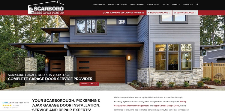
Scarboro Garage Doors separates its products and services into two categories. They have a section for residential customers and commercial ones.
Note as you mouse over the navigation bar, you’ll see a drop-down menu that states either “Residential” or “Commercial.” Users click on the subcategory that makes sense for their needs.
Beat Your Competitors
Spend time surveying the websites of your closest competitors. What features do they provide? Start by matching what they do best. Your site should be equally good. Look for elements such as:
- The contrast between background and text.
- Do they use videos?
- How much content do they have? What topics do they cover?
- Is their site mobile-friendly?
Next, analyze your site. Do you have similar elements on your pages? Is anything missing?
More and more people access the internet via their mobile devices. Have you thoroughly tested your site on an actual smartphone? If anything doesn’t load correctly or is unreadable, fix it. Put yourself in the place of the busy company owner who hops on his phone for a minute to find a service he needs. Can he view your website easily, or is it a pain?
Define Your Unique Value Proposition (UVP)
No matter which customers you serve, you bring something unique to the table no other company does. What is your UVP? How does choosing you over a competitor benefit your clients?
Make sure your UVP is in the headline of your site.
When people get pushed into a segmented area, the UVP may have an addiction. For example, if you sell potholders to both restaurants and households, you might state your potholders last longer than any other on the market.
For the commercial landing page, you would add they withstand the rigors of everyday use. For the consumer landing page, you might mention they still look good after years of cooking.
Think about what each segment of your audience cares about and how you provide an answer to their problems.
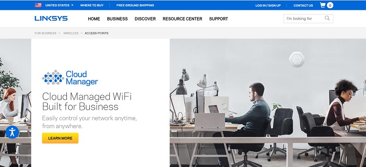
Linksys states the benefits of its products for each of its audience segments. Business owners will see that it offers cloud-managed Wi-Fi so they can manage the network from anywhere.
Cloud computing is a huge benefit to companies with remote workers, for example.
Their home landing page focuses on how their whole-home mesh Wi-Fi provides access to all online activities in a residential building.
By focusing on the UVP for each product type, they directly target the leads in each segment.
Improve the Buyer’s Journey
Have you ever landed on a beautifully designed website and not known what to do next? A failure in the buyer’s journey will leave your site visitors hanging.
There is no clear path or explanation of what action to take next.
Write out the steps each of your customer personas should go through from the minute they land on your site until they convert into a lead or a customer.
Check the movement from one touchpoint to the next is apparent.
Use calls to action (CTAs), arrows, videos, and commands to drive them through the sales funnel.
The journey starts on your home page, but keep in mind visitors might land on any page on your site and need direction on where to go next.
Questions such as whether they are consumers or business owners are excellent segues into the next series of interactions.
Web Design Improvements: Get Feedback
Survey your regular customers. What do they love and hate about your site? Check out calls to customer service. Is there any area where people get bogged down and confused?
How can you fix those issues before they become problems for the user?
For every person who phones for help, many others bounced away, never to return.
Use any information clients give you to improve your site and make it more user-friendly. Excellent UX should be your priority, no matter what kind of website you run.
Targeting business and consumer clients means you have a few more touchpoints than firms serving only one or the other.
Perfect the stages, and your site will rise above the competition.