Simple Geometry With a Powerful Effect: Minimalist Logos
It is fascinating to think that a pair of simple geometric shapes can touch the senses and raise a powerful associative wave. It is enough to place the elements correctly and choose catchy colors. One such example is the YouTube logo and the similar Roblox icon. Let’s see how trivial geometry is revealed in a competent concept.
Features of YouTube and Roblox logos
The YouTube and Roblox icons represent a simple figure within a figure. In the first case, it is a triangle in a swollen rectangle, in the second – squares offset at an angle. The magic begins with meanings. Symbols carry tremendous power for our perception, as they pry associative chains and activate the imagination. A pair of correctly spaced lines allows you to recreate a whole world full of vibrant colors.
YouTube secret
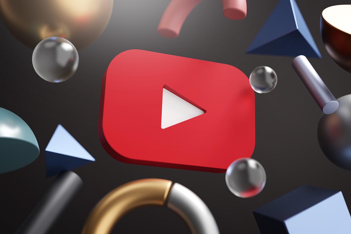
YouTube specialists took advantage of this technique when creating their own logo. In fact, this is the “play” icon, which has long been known to users since the advent of audio and video equipment. It was enough to give it a welcoming softness and volume due to the swelling of the outer lines and choose an inviting flashy color.
Red instantly attracts attention and encourages “click”, “try”, “there is something interesting.” The play button becomes noticeable in almost any environment, and the logo is recognizable and distinctive. This neutral graphic font is universally suitable for business, scientific, and entertainment videos on any topic.
Features of the Roblox badge
The guys from Roblox went the same way. The concept of the platform is a minimalistic constructor of games and virtual worlds. Everything in it is made up of digital bricks like Tetris. Therefore, the logo capaciously reflected the essence of the project. A laconic angular font was chosen for it, and to make the inscription creative, one of the letters “o” was “filled up”. She also became a short symbol that is used as an icon. This double square is the essence of the platform, where everything starts from the first block and turns into a whole virtual universe.
The previous Roblox logo was more creative. It was written as if by hand in an angular awkward font, hinting at the robot-men used in games. The disadvantage was the scale of the inscription – it could not be reduced to one characteristic symbol. The final laconic version got its own flavor and took root in the memory of users.
Minimalist Logos: Interesting Facts
As a result of several studies, scientists have concluded that “talking” puzzle icons attract more attention. When a hidden meaning is read in a laconic and simple logo, it spurs consumer interest. When specific and highly detailed (for example, a portrait, an animal, a complex object), it is perceived as a pretty print or sticker, but not associated with anything serious. On the other hand, people do not remember minimalistic unreadable symbols because they cannot build an associative array.
The PR people of YouTube and Roblox did their job perfectly, choosing the middle ground. Their laconic catchy logos are easy to remember and reproduce, as they are not overloaded with unnecessary details. At the same time, we immediately understand what the icon is talking about: the video is stored here, and there is something connected with digital construction. If you have ever been to the platform, you will remember what happened.
Looking at such an example, we can conclude that simple but meaningful geometric images will be an excellent base for an easily recognizable “selling” logo in any field. The main thing is not to overload the picture with details and lay in it a strong associative array.