Why Your Landing Page Looks Fine, but Kills Your Conversions
✨Key Points
- Landing pages often fail due to hidden technical issues, not design or traffic quality.
- Rising costs and smarter algorithms mean small friction points now directly reduce conversions.
- A technical SEO audit reveals unseen problems that silently block leads and waste ad spend.
It didn’t used to feel like this.
You’d launch a landing page, turn on your ads, and within a few days you’d see leads come in.
Maybe not perfect—but predictable.
Now?
You’re checking your dashboard every morning, hoping something changed… but it hasn’t.
Clicks are coming in, but conversions are flat
Your cost per acquisition keeps creeping up
You tweak headlines, buttons, even redesign the page—and nothing really moves
Everything looks right, but something clearly isn’t
And the most frustrating part is that you don’t know what’s actually broken.
Because landing pages today aren’t just about design or copy anymore.
They’ve become critical decision points in your funnel, where people decide in seconds whether to trust you, take action, or bounce.
And here’s something most people overlook, context matters more than ever.
In a region like the Pacific Northwest, “loud” marketing often falls flat.
People don’t respond to hype—they respond to authenticity.
If your landing page is trying too hard to sell instead of actually connecting, it creates instant resistance.
Your value proposition shouldn’t just list features—it should speak to real, everyday frustrations.
Things like:
- Not having enough time to enjoy the outdoors;
- Feeling drained during long, dark seasons;
- Wanting simpler, more efficient solutions that just work.
When your messaging aligns with how people actually live, trust builds faster, and conversions follow.
But even with the right message, execution still matters.
Every tiny friction point adds up, from load speed to mobile experience to how smoothly the page flows.
What makes it worse is that small technical issues, things you don’t even notice at first, can quietly kill your conversions.
A slightly slow page, a layout shift on mobile, or a crawlability issue can be enough to stop momentum completely.
That’s why a proper technical SEO audit isn’t optional anymore, it’s how you figure out what’s actually holding your page back.
You need to look under the hood:
Is your page loading fast enough on real devices (not just tests)?
Is the mobile experience truly smooth, or just “acceptable”?
Can search engines actually crawl and understand your page properly?
Are hidden technical issues creating friction you can’t see?
Because in 2026, with smarter algorithms, AI-driven optimization, and more competition than ever, “good enough” quietly turns into lost revenue, and that’s exactly where a technical SEO audit service becomes essential.
In this guide, we’ll break down the most practical landing page optimization strategies and technical fixes, so you can finally understand what’s going wrong and start turning clicks into real results.
Understanding Your Audience
Most landing pages don’t fail because of bad design, they fail because they’re speaking to the wrong person.
If you don’t fully understand your audience, everything else becomes guesswork.
Your messaging feels “off,” your offers don’t land, and visitors leave without taking action, even if your page looks perfect.
And sometimes, it’s even more subtle than that.
Take what many call the “Seattle Freeze” in marketing.
We usually think of it as a social behavior, but it shows up online too.
A lot of PNW users aren’t ready to talk right away.
They’re researchers first, decision-makers second.
If your landing page pushes a “Book a Call” as the only next step, you’re not guiding them—you’re shutting them down.
In many cases, you’re freezing out a huge portion of potential leads before they’ve had a chance to trust you.
That’s where most pages get it wrong.
Instead of forcing commitment, you need to create low-friction entry points that match how people actually behave:
A downloadable guide they can explore on their own;
A “quiet” case study that shows real results without pressure;
A simple walkthrough of how your process works;
Anything that lets them learn before they have to talk;
Because when people don’t feel pressured, they stay longer, engage more, and move forward on their own terms.
And that only happens when your page is built around who they are—not just what you want them to do.
That’s why audience research isn’t optional, it’s the foundation of whether your landing page converts or not.
When you take the time to really understand who you’re targeting, things start to click:
- You stop guessing what to say and start speaking directly to real pain points;
- Your messaging feels relevant instead of generic;
- Visitors recognize themselves in your copy and trust builds faster;
- Conversions increase because the page actually matches their intent.
By digging into your audience’s demographics, behaviors, and real frustrations, you can build clear buyer personas that guide every decision, from headlines to CTAs.
Because at the end of the day, if your landing page doesn’t resonate with the right people, no amount of traffic or optimization will fix it.
Clear and Compelling Value Proposition (Without the Confusion)
The difference between a page that converts and one that doesn’t? One makes promises, the other makes people feel certain they’ll get the result.
Most landing pages don’t fail because the offer is bad, they fail because the message creates doubt instead of clarity.
And today, that doubt shows up fast.
Clients don’t want to feel like they need to “figure things out” before working with you. In the past, they might’ve been asked for technical specs or detailed requirements—but now, that often feels overwhelming and even risky.
Because if something goes wrong, it can feel like it was their fault for not providing the “right” input.
That’s exactly what your landing page needs to eliminate.
A strong value proposition doesn’t just explain what you do, it reassures the visitor that you already know what you’re doing, and they don’t need to carry that burden.
You’re not asking them for perfect instructions. You’re showing them you’ve done this before, and you’ll guide the process from start to finish.
That includes handling the technical side. You define the specs. You structure the work. You make the decisions that lead to the outcome.
Your landing page should make them feel:
“I don’t need to figure this out—they’ve got it covered”
“They clearly know what they’re doing”
“I’ll get exactly what I need, not something vague”
“This feels simple, not overwhelming”
“I can trust them to deliver the result”
Instead of pushing complexity onto the client, position yourself as the expert who takes ownership:
- You define the process;
- You provide the technical direction and specs;
- You translate complexity into clear outcomes;
- You take responsibility for delivering results.
Because in a fast-moving, high-stakes digital environment, people aren’t just buying a service, they’re buying certainty.
And when your landing page communicates that clearly, everything changes: less hesitation, more trust, and far more conversions.
Streamlined Design and Layout (That Actually Converts)
A complicated landing page doesn’t make you look more professional, it makes people leave.
When visitors land on your page, they’re not there to figure things out.
If the layout feels busy, unclear, or overwhelming, they won’t try harder, they’ll just exit.
That’s why simplicity isn’t a design choice, it’s a conversion strategy.
Your page should instantly guide people to what matters:
What this is about (headline)
Why it matters to them (key benefits)
What to do next (clear CTA)
No distractions, and no clutter.
And it’s not just about how it looks, it’s how it works:
Loads fast (because people won’t wait)
Feels smooth on mobile (where most traffic comes from)
Keeps attention focused instead of scattered
Because the easier your page is to follow, the easier it is for someone to say yes.
Effective Call-to-Action (CTA) Strategy
Most CTAs don’t fail because of color or size, they fail because they don’t answer one simple question:
“What happens if I click this?”
If that’s not instantly clear, people hesitate. And hesitation kills conversions, we have only 1,7 seconds to convert, before it was 3 sec.
Your CTA’s job isn’t just to stand out, it’s to remove doubt and make the next step feel easy and safe.
Here’s what actually makes a CTA work:
Be specific, not generic
“Submit” or “Click here” = friction
“Get My Free Audit” or “See My Options” = clarityReduce risk in the wording
Add reassurance right next to it:
No commitment • Takes 30 seconds • No credit card requiredMatch the intent of the page
If someone isn’t ready to buy, don’t push “Buy Now”
Offer a softer step: Get a Quote, See How It Works, Book a Free CallMake it feel like a step, not a decision
People don’t want to commit—they want to explore safelyPlace it where decisions happen
After key benefits, after proof, and again at the end
And yes, design still matters, but only after the message is right:
Make it easy to see (contrast, size)
Keep it consistent across the page
Don’t overwhelm with too many options
Because a high-converting CTA doesn’t push people, it guides them, and makes the next step feel obvious, low-risk, and easy to take.
Social Proof and Trust Signals (Remove Doubt Before It Starts)
People don’t convert because they’re convinced they convert because they feel safe enough to move forward.
And right now, most visitors are skeptical by default.
They’ve seen too many overpromises, too many vague offers, and too many things that didn’t deliver.
So when they land on your page, they’re not asking “Is this good?”
They’re asking:
“Can I trust this, and will this actually work for me?”
If your page doesn’t answer that quickly, they won’t take the risk.
That’s where social proof comes in—but only if it feels real.
Here’s what actually builds trust:
Specific testimonials (not generic praise)
Weak: “Great service!”
Strong: “We increased conversions by 32% in 3 weeks after fixing our landing page.”Proof that matches your visitor. Show results from people similar to your target audience (same industry, problem, or goal)
Visible, not hidden. Don’t bury testimonials—place them near decision points (next to CTAs, after benefits)
Real details matter. Names, photos, company names—anything that makes it feel authentic
Then reinforce that trust with simple reassurance:
- Security signals (safe checkout, data protection)
- Clear expectations (what happens next, no surprises)
- Certifications or credentials (if relevant—but don’t overdo it)
Because at the end of the day, people aren’t just buying your service they’re deciding whether to trust you.
And the easier you make that decision, the easier it is for them to say yes.
A/B Testing and Continuous Optimisation
Landing page optimisation is an ongoing process that requires constant monitoring and refinement.
Implement A/B tests to experiment with different elements of your landing page, such as headlines, images, and CTAs, and analyse the results to identify what resonates best with your audience.
Continuously optimise your landing pages based on data-driven insights to maximise conversions and ROI.
Optimisation for SEO and Paid Advertising

Driving traffic isn’t the hard part anymore.
Driving the right traffic that actually converts—that’s where most pages fail, and it’s exactly what the future of SEO is all about.
Here’s what usually goes wrong:
- Your ad promises one thing;
- Your landing page says something slightly different;
- Your social post frames it another way;
- AI tools and search engines interpret it inconsistently.
And the visitor? They hesitate… and leave. That disconnect kills conversions instantly.
Today, it’s not just about SEO or paid ads. Your landing page needs to align across search, AI (LLMs), and social media—because users are coming from all directions.
At the same time, search itself has changed.
Your page isn’t just being read anymore, it’s being interpreted, summarized, and recommended by AI systems before people even click.
That means clarity isn’t optional, it’s critical.
In 2026, your page is judged twice: first by machines, then by people.
If AI can’t clearly understand what you do, who you help, and why it matters, you won’t even get seen.
What to focus on:
Keep your message consistent. Your ad, landing page, and social content should say the same thing—no mixed signals.
Match intent exactly. Your page should feel like the exact answer to what the user searched or clicked on
Optimize for LLMs (AI-driven discovery). Use clear, structured content that directly answers questions (no fluff, no guesswork.)
Write for both humans and machines. Titles and descriptions should be compelling and clearly explain what the page delivers.
Use simple, scannable language. This improves readability and helps AI interpret your content correctly
Structure your content clearly. Use headings, bullet points, and short sections so key information is easy to extract.
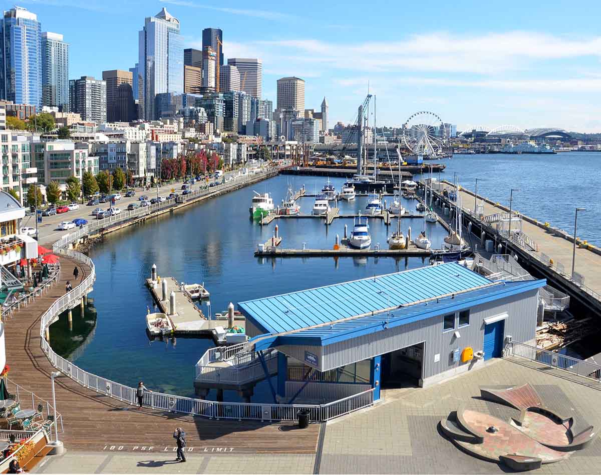
Be specific (especially locally). Mention areas like Greater Seattle, Bellevue, or the Pacific Northwest to strengthen relevance.
Conclusion
In conclusion, mastering the art of landing page optimisation is essential for driving conversions and achieving your marketing objectives.
By implementing the top tips and tricks outlined in this guide, you can create landing pages that captivate visitors, inspire action, and ultimately, drive results.
Remember to conduct a technical SEO audit service to address any underlying issues that may be hindering your landing page performance.
For professional SEO services in Perth that deliver tangible results, trust Ambire to elevate your online presence and drive growth.