Jewelry Packaging That Boosts Sales: Presentation Strategies That Work
✨Key Points
Packaging shapes first impressions, influencing how customers perceive value before they even see the jewelry.
Colors, textures, and personalization build brand identity, turning unboxing into a memorable experience.
Small details and consistency across every element increase trust, repeat purchases, and overall sales.
Packaging has quietly become one of the strongest selling tools in jewelry retail, shaping first impressions before a single piece is revealed.
It’s the silent storyteller of a brand, speaking through touch, texture, and tone long before words or sales pitches appear.
Across modern jewelry markets, presentation has evolved from simple wrapping to a sensory experience.
The box, the paper, the color, everything works together to tell customers what kind of brand they’re investing in.
Strong packaging design communicates value without a single line of copy.
In a place where craftsmanship meets perception, the details decide the outcome.
Starting With Quality That Reflects the Brand
Every story begins with the product itself. Jewelry that’s crafted well gives packaging something genuine to elevate. Without this, no amount of ribbons, satin, or gold foil can build trust.
Quality commands its own attention, setting the standard for everything that follows.
Suppliers like Wholesale Jewelry Website (WJW) stand out here.
As a leading wholesale jewelry supplier, WJW proves that quality and presentation are inseparable.
Their approach to craftsmanship makes packaging feel like a continuation of excellence, not decoration.
The box, the clasp, the card inside, each element echoes the precision of the jewelry it carries.
Customers don’t need persuasion when the product and its presentation speak the same language.
Color Coordination with Brand Identity
Color has a way of deciding mood before the mind catches up.
Deep navy whispers sophistication, while pale blush softens the tone into calm elegance.
Every shade sends a message, and smart brands use that language deliberately.
Matching the color story to the brand’s personality creates recognition faster than any tagline.
Whether through box linings, ribbons, or printed tissue, a cohesive palette turns packaging into an extension of identity.
A customer should be able to spot your box across the room and know instantly who it belongs to.
Unboxing That Builds Anticipation
Every unboxing moment is a performance, and the stage is small but powerful.
The sound of paper folding, the weight of the box, the soft pull of ribbon, each moment adds tension in the best possible way.
The jewelry inside becomes the finale, framed by a buildup of quiet detail.
Each movement, each layer, needs to feel deliberate.
When customers pause before they reach the jewelry, they’re already invested in what they’re about to see.
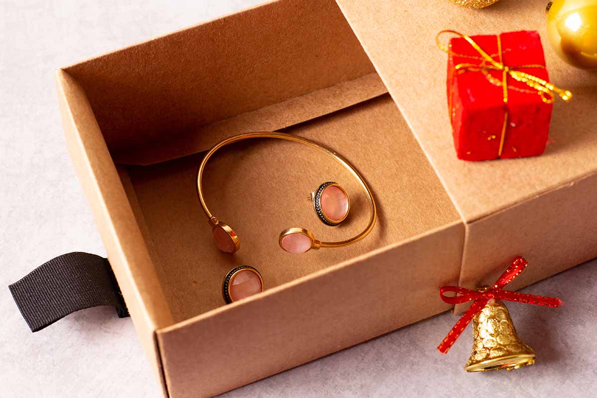
Personalization That Feels Genuine
A customer’s name printed neatly on an insert, a short message tucked beneath the jewelry, or a subtle thank-you note handwritten with care, personalization works because it feels rare.
People recognize authenticity the second they see it.
True personalization doesn’t need grand gestures, but sincerity.
A simple message that feels real can turn one purchase into lasting loyalty.
Subtle Branding That Complements Design
Logos have power, but subtlety has style. Branding that’s quiet leaves room for curiosity.
An embossed emblem, a metallic imprint, or a soft watermark can communicate confidence better than bold slogans ever will.
The most effective branding merges with the design instead of sitting on top of it.
Customers don’t need to be reminded of a logo when the entire experience already carries its essence.
A brand that understands restraint earns elegance without saying a word.
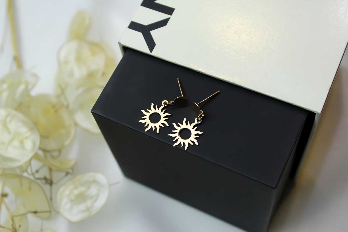
Texture and Finish That Add Depth
Surfaces speak louder than slogans.
A matte box feels grounded; a glossy one feels indulgent.
Texture tells the customer what kind of brand they’re holding before the lid even opens. Every touchpoint, from ribbon to fabric lining, shapes a physical connection that lingers long after purchase.
Finish, when chosen with intent, creates memory.
A velvet insert, a magnetic closure, or a soft grain under the fingertips turns ordinary packaging into a tactile experience.
Customers may forget the tagline, but they’ll remember how the box felt when they opened it.
Small Details That Show Care
Perfection hides in the smallest details.
A neatly folded corner, a tag that doesn’t dangle awkwardly, a ribbon that sits just right, none of it shouts for attention, yet all of it signals care.
Customers notice precision even when they don’t consciously look for it.
Those quiet gestures say more than marketing ever could.
A well-presented box tells the buyer that their jewelry wasn’t rushed through a process; it was guided through one.
Consistency Across Every Element
Strong branding doesn’t skip steps.
A customer’s impression forms from a complete picture, from the shipping box to the final reveal.
Cohesive packaging creates trust because it shows control. Everything looks like it belongs to the same story.
Uniform textures, colors, and fonts show discipline. They tell customers the brand is confident, organized, and reliable.
The feeling of familiarity that follows is subtle but powerful.
Seasonal or Limited Designs
Limited-edition designs and seasonal variations bring freshness without breaking identity.
A winter shimmer, a spring pastel, or a gold-foil sleeve can keep returning customers curious.
Such updates feel like new chapters rather than rebrands.
Seasonal details keep jewelry lines relevant year-round and remind customers that the brand evolves without losing its core appeal.
Layering That Invites Discovery
Every layer of packaging should lead somewhere, a tissue fold that hints at color, a seal that breaks cleanly, a final reveal that lands with quiet impact.
Layering turns the unboxing into an unfolding story rather than a single action.
Each step gives the customer a reason to linger.
As they pause to open, touch, and notice, the jewelry earns their full attention.
Jewelry speaks through its shine, but packaging speaks first. Every color choice, fold, and ribbon placement carries intent.
The right packaging never distracts from the piece inside, but it prepares the stage for it.