What is a Histogram?
Data is everywhere today. You may not realize it, but it affects our everyday life, be it online shopping, your mobile apps, your smartwatch, everything is run by data. No industry can function without studying and analyzing data. Now, what if we can have a visual representation of data? Wouldn’t that be easier? Yes! Histogram does the job for us. This blog post will help you explore Histograms, their uses, and how it makes our life easier.
Let’s dive in then
Here is the table of contents. Feel free to jump to any of the topics directly.
Introduction to Histograms: What is a Histogram?
A histogram is a graphical representation of data where data is grouped into continuous number ranges and each range corresponds to a vertical bar. The horizontal axis displays the number range and the vertical axis (frequency) represents the amount of data that is present in each range.
When we discuss Histograms, we talk about large sets of data because the more data values, the better. After we collect all of the data, it will be saved in the form of graphs so that it’s easier to analyze them, which helps in decision making.
The histogram is a variation of the bar chart with the distribution of data sets. It is similar to a bar chart, but histograms group numbers into ranges. There are different types of histograms based on their shapes. Let’s explore some of them.
Types of Histogram
There are mainly 6 types of histograms.
Bell-shaped histogram
It has a single peak in its distribution and therefore, it resembles a bell in a temple.
2. Bimodal histogram
It has two peaks because it is created by summing two different distributions.
3. Skewed right histogram
This histogram is skewed to the right which means it has a decreasing slope towards the right.
4. Skewed left histogram
This histogram is skewed to the left, which means it has an increasing slope towards the right.
5. Uniform histogram
This histogram looks like a rectangular slab because all its frequencies are almost the same.
6. Random histogram
There is no clear pattern in the histogram.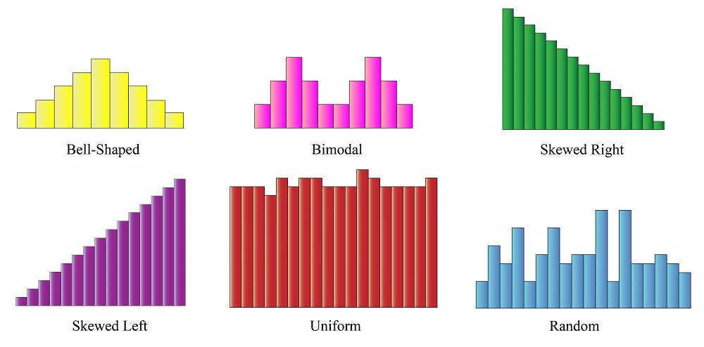
We are now familiar with the different types of histograms. Now let us see some of their properties.
Properties of histograms
- The bars don’t have any gaps between them.
- It represents only quantitative data as the Y-axis takes only frequencies.
- The horizontal axis represents the number range.
Everything has a special purpose, and so does a Histogram! You will be surprised to know how Histograms are used in our day to day life. Have a look at some of the cases below:
Uses of histogram
- Histograms are used when data shows numbers in the form of years, months, days, or time.
- Histogram makes it easy to visualize the shape of the whole data set. The shape of the data set also gives us an idea of its distribution.
- Histograms can help in analyzing whether a process can meet the customers’ requirements.
- It can help in analyzing what the output from a supplier’s process will look like.
- Histograms help in checking whether a given process has changed from one time period to another.
- Histograms help in determining whether the outputs from two or more processes are different.
Making a histogram is very simple. You can build your own histogram of your monthly scores in exams. Even in a cricket match, this simple graphical representation of data is used to depict the runs scored per over. It sounds interesting. Isn’t it? Let’s construct a Histogram then!
Construction of a histogram
Step-1:
Collect at least 50 data points from a process.
Step-2:
Choose a suitable scale on the horizontal axis and vertical axis.
Step-3:
Draw the bars corresponding to the range on X-axis using their frequencies on Y-axis. It looks something like this.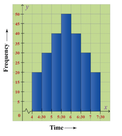
Let’s understand this with the help of an example.
Example
Given below is the frequency distribution of the heights of 50 students in a class.
| Class interval | 140-145 (in cms) | 145-150 (in cms) | 150-155 (in cms) | 155-160 (in cms) | 160-165 (in cms) |
| Frequency | 8 | 12 | 18 | 10 | 5 |
Solution
Step-1:
The class interval is in a range. So this should go along X-axis and frequency will go along as Y-axis.
Step-2:
You can note here that the range is starting from 140. So we need to use a kink at the starting of the X-axis.
Step-3:
Put the ranges along X-axis and frequency along Y-axis.
Step-4:
Build rectangles for each range such that its width represents the range and its length represents the frequency.
Step-5:
Also, write down the scale on the top right of the diagram.
Do you want to see how it looks?
So, HERE IT IS!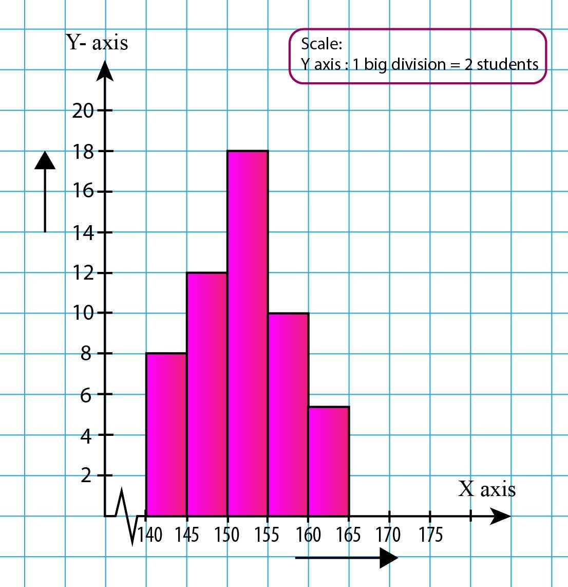
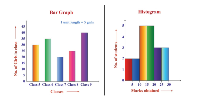
Now, do you remember the bar graphs? They are similar to histograms, but there is a fine gap between them.
Let’s discuss that.
Difference between a Bar chart & Histogram
The bar chart is a graphical representation of categorical data using rectangular bars that are proportional to the magnitude of each item on the X-axis.
| Bar Chart | Histogram |
| There is a gap between every bar. | It is continuous. |
| It is used to show categorical data. | It is used to show quantitative data. |
Let us now have a look at some of the FAQs
Frequently asked questions(FAQs)
1. What is a histogram? Give an example.
The histogram is an approximate representation of the distribution of numerical data.
For example, the runs scored in all calendar years by a player in his cricket career.
2. What are the types of histograms?
- Bell-shaped
- Bimodal
- Skewed Right
- Skewed Left
- Uniform
- Random
3. What is the histogram used for?
- Histograms are used to summarize large data sets graphically.
- It can assist in decision making.
- It can be used to compare measurements to specifications.
- Histograms can help in Identifying the data symmetry.
4. What is the difference between bar charts and histograms?
- In bar charts, each column represents a group defined by a categorical variable, and bars have space between them.
- In histograms, each column represents a group defined by a continuous, quantitative variable, and bars cannot have space
5. Do histograms have gaps?
- Histograms divide the range of values into classes or groups called bins. When the variables are continuous there is no gap between the bars.
6. What is the purpose of the histogram?
- The purpose of the histogram is to graphically summarize the set of numerical data.
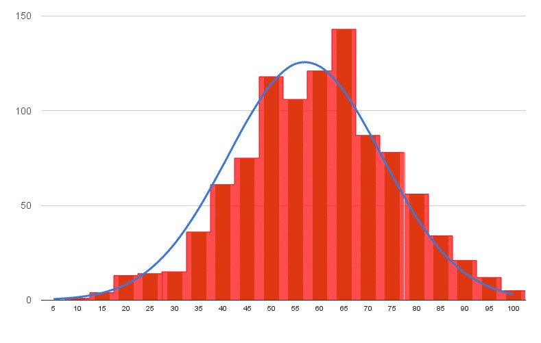
6. How does the histogram look?
Have a look at this histogram
Histograms are one of the most common graphs that are used to display numerical data.
It can summarize huge amounts of data graphically, which can help in decision-making by analyzing the data.
You can learn all about Histograms on Cuemath by just clicking here. Cuemath is one of the leading Math platforms which makes Math super easy and fun! Because at Cuemath, students can learn at their own pace through various learning tools like Numeric puzzles, worksheets, tab exercises, puzzles, math boxes, and much more.
And in case you want to build some math muscles, Cuemath also has a math gym! I hope you had fun exploring Histograms. If you have any queries, please mention them in the comment box below. Thank you for spending your time here. I hope it was a good read.