Why Avatars Are Losing Popularity and What the Era of Organic Content Looks Like Now
✨ Key Points
Audiences now prefer real and relatable visuals over illustrated avatars. As digital spaces become more crowded, users trust designs that feel grounded in real-world environments. Avatars often feel artificial, while realistic visuals signal credibility and professionalism.
Organic, realistic design supports authenticity without pretending to be human. Modern visual systems—such as professional icon sets—create trust by using familiar shapes, subtle depth, and clear structure, making them ideal for corporate and product environments.
Scalable, customizable visual systems replace avatars in modern digital products. Vector-based, realistic icons adapt easily across platforms and sizes, allowing brands to maintain a consistent, trustworthy identity without relying on stylized representations.
For years, avatars dominated digital identity.
From cartoon profile pictures to overly stylized illustrations, avatars were once seen as a safe, creative way to represent people and brands online.
They felt modern, flexible, and platform-friendly. But in 2026, something has clearly changed: avatars are no longer the default—and in many contexts, they actively feel outdated.
This shift isn’t about aesthetics alone.
It’s about authenticity, trust, and how audiences now interpret visual signals in a saturated digital world.
Welcome to the era of organic content.
Why Avatars No Longer Feel Right
Avatars rose in popularity because they solved early digital problems.
They offered privacy, consistency, and a polished look when cameras, bandwidth, and platforms were limited. But today, those constraints no longer exist.
What has changed is audience behavior.
People have become highly sensitive to signals that feel artificial, overly curated, or disconnected from reality.
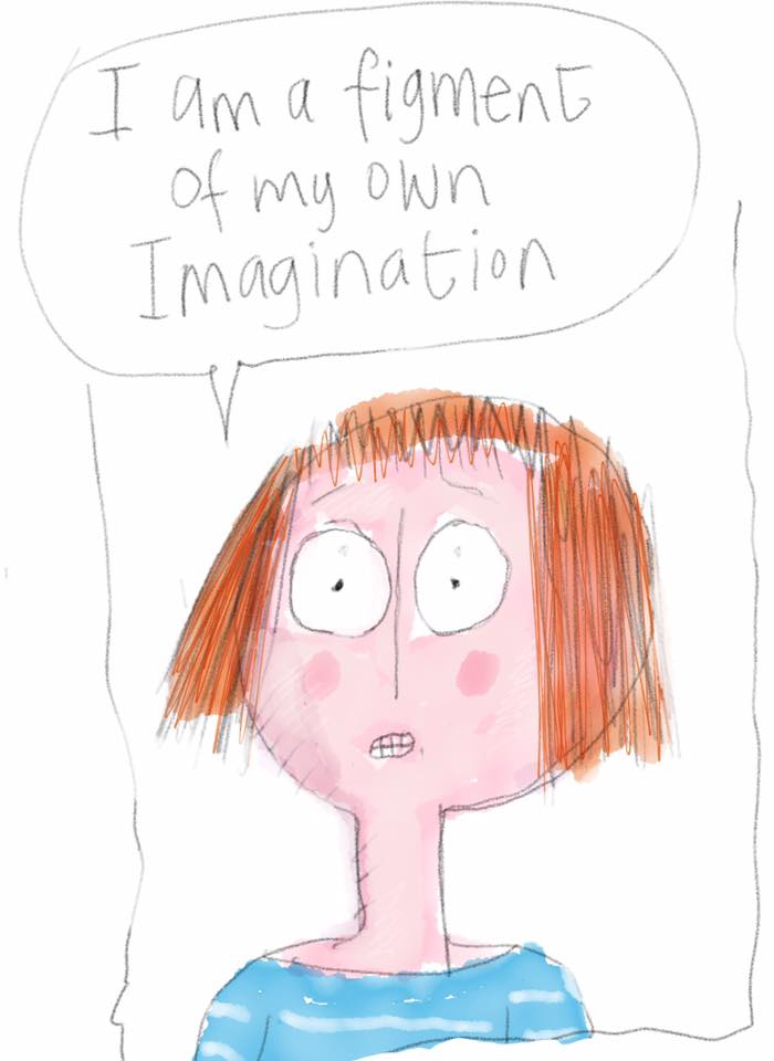
Avatars—especially generic or cartoon-like ones—now often communicate distance rather than personality.
Instead of asking “Does this look good?”, users subconsciously ask:
Is this real?
Is this honest?
Is there a human behind this?
In professional, corporate, and product-driven environments, avatars increasingly fail that test.
Authenticity Has Become a Visual Requirement, Not a Buzzword
Authenticity used to be something brands talked about. Now it’s something audiences expect to see.
This doesn’t mean everything must be raw or unpolished. It means visuals need to feel grounded, intentional, and credible.
Real lighting. Real proportions. Real textures. Visual systems that resemble the environments people actually work in.
This is why organic content—content that feels natural, unforced, and human—has replaced stylized abstraction as the dominant trend.
And it’s not limited to photography or video. It extends directly into UI design, iconography, and digital products.
From Avatars to Professional Visual Identity
As avatars fade, something else is taking their place: realistic, professional visual systems that communicate reliability without pretending to be human.
Instead of illustrated faces, brands now rely on:
Clean, realistic iconography;
Cohesive visual language;
Subtle depth, light, and shadow;
Familiar shapes inspired by real-world objects;
These elements don’t compete with human identity. They support it.
They say: this is a serious tool, built for real work, by people who understand your environment.
The Rise of Sophisticated, Organic Icon Systems
This shift explains why realistic icon sets are regaining relevance—when done correctly.
Design teams have long wrestled with a difficult question:
Is it possible to create icons that feel as impressive and tangible as classic operating system visuals, while still being scalable, customizable, and modern?
The answer lies in a new generation of design systems built around realism without excess.
Sophisticated icon collections—designed with clear shapes, subtle shine, and controlled shadows—bring back depth and tactility without sacrificing flexibility.
They feel familiar, corporate, and trustworthy, reflecting the environments they’re used in: offices, dashboards, enterprise software, and professional tools.
What “Organic” Really Means in Visual Design
Organic does not mean messy or unstructured.
In design, organic content means:
Visuals inspired by real-world materials and lighting;
Colors that reflect modern working environments;
Depth that suggests function, not decoration;
Consistency across scale and context;
This is why vector-based, realistic icon systems are particularly effective.
They maintain detail and clarity whether used at small UI sizes or large presentation formats—without distortion or loss of intent.
They adapt to the product instead of forcing the product to adapt to them.
Why This Matters for Corporate and Product Design
In corporate environments, trust is everything.
Software tools, dashboards, internal platforms, and enterprise products benefit from visuals that feel stable and reliable.
Overly playful avatars or cartoonish elements can undermine credibility, especially in professional contexts.
Realistic iconography:
Reduces cognitive friction;
Feels familiar to users;
Supports clarity and usability;
Aligns with modern expectations of professionalism.
This is particularly important as digital products replace more physical tools.
The interface becomes the environment—and its visuals need to feel dependable.
Customization Without Losing Identity
One of the historical arguments against realistic design was rigidity.
But modern vector-based systems have eliminated that limitation.
Today’s realistic icon sets are:
Fully scalable;
Easily recolored;
Adaptable across platforms;
Consistent in form and proportion;
This makes them ideal for software development, desktop publishing, internal tools, and brand systems that require both flexibility and visual integrity.
The Bigger Picture: From Representation to Reality
The decline of avatars reflects a broader cultural shift.
People no longer want representations that stand in for reality—they want visuals that support real interaction, real work, and real identity.
Avatars tried to replace the human element. Organic design supports it instead.
In the era of organic content, the most effective visuals are the ones that don’t demand attention, but quietly reinforce trust.
That’s why realism—done thoughtfully—isn’t a step backward.
It’s a correction.
Final Thought
Avatars aren’t disappearing entirely, but their dominance is over.
As audiences prioritize authenticity, professionalism, and clarity, visual design is moving toward systems that feel real, grounded, and intentional.
Realistic, corporate iconography fits naturally into this shift—not as decoration, but as infrastructure.
The era of organic content isn’t about being louder or trendier. It’s about being believable.
And in today’s digital world, that’s the most valuable design choice of all.


