How to Choose Art Prints for Small Spaces
✨ Key Points
- One large statement print often makes a small room feel cleaner and more spacious than several tiny frames.
- Coordinated colors, vertical artwork, and light frames help reduce visual clutter and create the illusion of more space.
- Strategic placement above furniture, across from an entrance, or at the end of a hallway guides the eye and improves the room’s balance.
Small spaces make every decorating decision more noticeable, and the wrong art can quickly leave a room feeling cramped, cluttered, or unfinished.
A collection of tiny frames may overwhelm a narrow wall, while one oversized print can dominate the entire room if the proportions are wrong.
Yet thoughtfully selected art can have the opposite effect: it can create a clear focal point, draw the eye upward, connect the room’s colors, and even make the space feel larger.
Before choosing art prints for a small room, focus on four practical elements:
- The size of the artwork in relation to the wall and furniture;
- A coordinated color palette that does not create visual clutter;
- Vertical placement that makes low ceilings appear higher;
- Simple frames and strategic positioning that guide the eye through the room;
The goal is not to fill every empty wall, but to choose fewer, stronger pieces that add personality while helping the space feel balanced and open.
One Strong Piece Beats A Collection Of Small Ones
Our tendency in a compact room is to play safe and choose smaller art.
But one large, statement-making print will accomplish more than five smaller pieces.
A big, single piece of art is arresting. It gives the eye a rest stop.
It’s a focal point, a visual anchor that informs the brain the room isn’t haphazardly decorated but carefully designed.
When you spread a collection of little frames willy-nilly across a wall, the eye has nowhere to rest.
The room appears cluttered, and cluttered rooms appear cramped.
If you’re hanging art above a piece of furniture, a sofa or a console table, you can’t go wrong with a handy rule: the art should measure between 60 and 75 percent of the furniture’s width.
It’s an old-shoe proportion from traditional design, but it works.
Tad wider and the art dominates in a clamorous way.
Tad narrower and the art floats aloof.
Color Is Doing More Work Than You Think
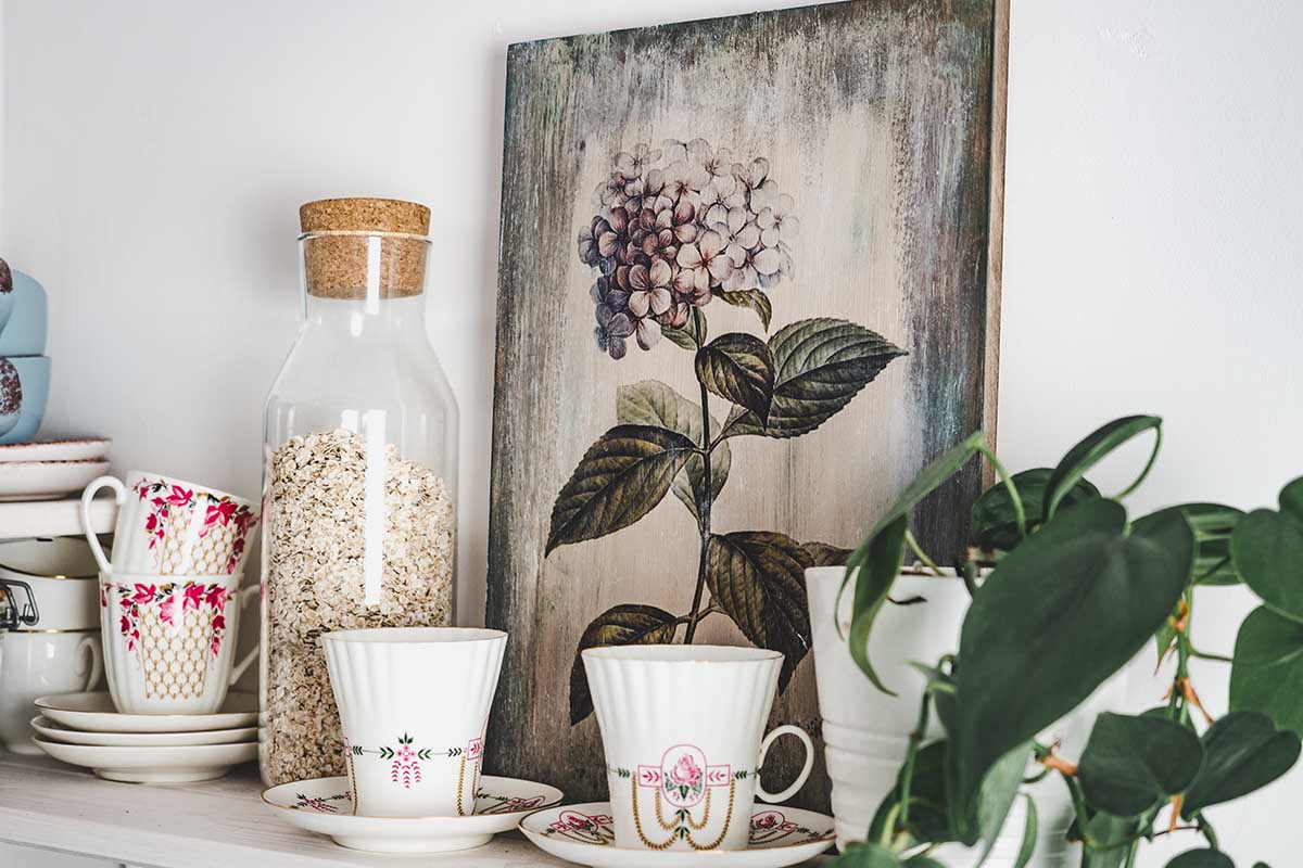
Have you ever considered how every print you put up on your wall is essentially adding more color to your room?
In the case of a small room, color can make or break the space.
The idea is not to have everything match, but to have as few colors competing with each other as possible.
A coherent palette can help a room not feel too busy. Cooler colors like blue, grey, and soft green tend to make the walls recede, meaning they look farther away.
Warm colors do the opposite.
This might make your room feel snug, but it can also make it feel like everything’s closing in on you if you’re not careful.
So when you’re starting from popular art prints, take a look at the colors that come across a number of them and consider if those work with the colors you’ve already got in the room.
A print that looks amazing but contains a lot of colors you haven’t used isn’t going to just look like a piece of paper on the wall.
One or two accent colors repeated elsewhere is enough to make the picture feel right at home.
Use Vertical Prints To Borrow Height From The Ceiling
Framing And Matting Change The Feel Of Any Print
The frame and mat you choose aren’t just finishing details – they’re part of how the print reads in the room.
Thin frames in light finishes – white, natural wood, pale brass – carry less visual weight than dark, heavy frames.
In a small space, that matters.
A dark chunky frame competes with the art and draws attention to itself rather than letting the image breathe.
Oversized white matting is one of the more underrated moves in a small space.
A mat that’s proportionally large compared to the print gives the image room around it, making a modest-sized piece look considered and gallery-like rather than just stuck on a wall.
It’s negative space working in your favor – the eye registers the breathing room and interprets it as intention.
Place Art Where It Directs The Eye, Not Where There’s Empty Wall
By default, people tend to try to fill all available wall space with art.
However, that’s not the same as strategically placing art where it has the most impact on a room.
When you hang or stand a print on the wall directly across from an entryway, it draws the eye invitingly in and helps the room feel more open and connected.
A beautiful print hung at the end of a hallway performs visual sleight of hand, turning dead space into an interesting nook.
Art in a reading nook turns an afterthought into an intentional space.
Art on a wall where the corner is visible carries the eye around that corner.
Art on a bathroom wall that can be seen from the living space contributes to the unified visual theme of your home.
Art isn’t just a wall-filler or afterthought.
It’s a tool that shapes your space, points the eye, and guides the movement of the observer.
Small spaces can’t afford to misuse this.
A room can always get by with less art, but it will never feel right with art that’s been haphazardly placed.